Texturing Plan - Stamps
The last few weeks we’ve been hard at work smashing out texturing, and a cool technique we’ve adopted is using stamps to re-use generic and atmospheric textures across the whole level. Tahlia has a list of at least 60 stamps to make, and is already halfway in just the last week alone!
“We have a pretty small team, so finding some kind of way to make texturing a bit less time consuming and more efficient was a priority over the last few weeks. I started illustrating very basic shaped and coloured props that can go on our vending machines and on walls so that the texturing process is quick and easy. The plus side is that the texture can easily be reapplied elsewhere and isn’t a messy or inconvenient process too!
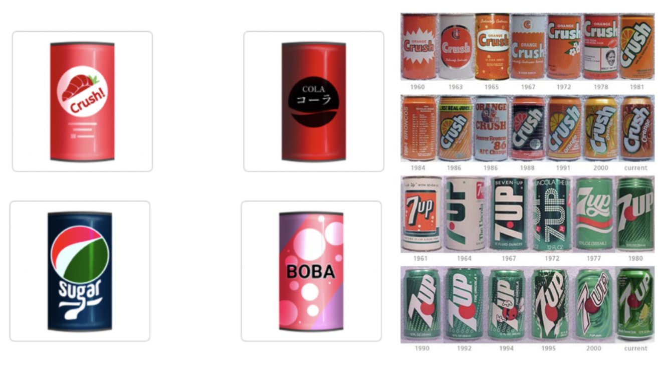
These cans all feature some pretty recognisable designs, but are also relevant to the time period the game is set in. The aesthetic of soft drink cans in the 1980s was very simple, blocky shapes with bright colours and easy to remember designs. Whilst some of the finer details are lost when we pixelate the textures, it adds a lot of unique-ness to each theoretical prop, rather than recolouring them and they all look identical. It was also a purposeful choice to make the can silhouette for the stamp slightly rounded, rather than just a flat rectangle. I found it was a bit difficult to really sell the idea that it was a can without curving the ends a bit…
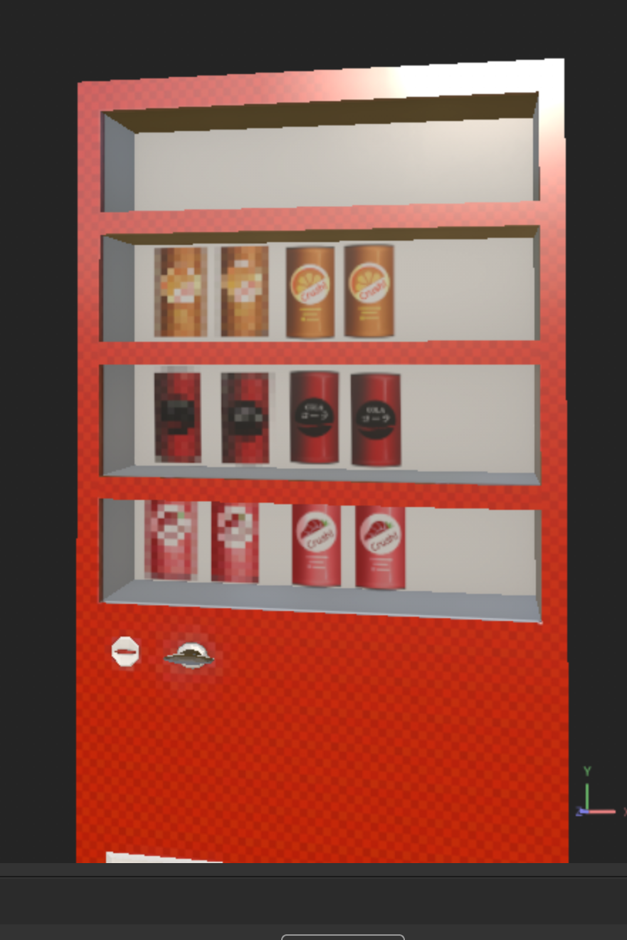
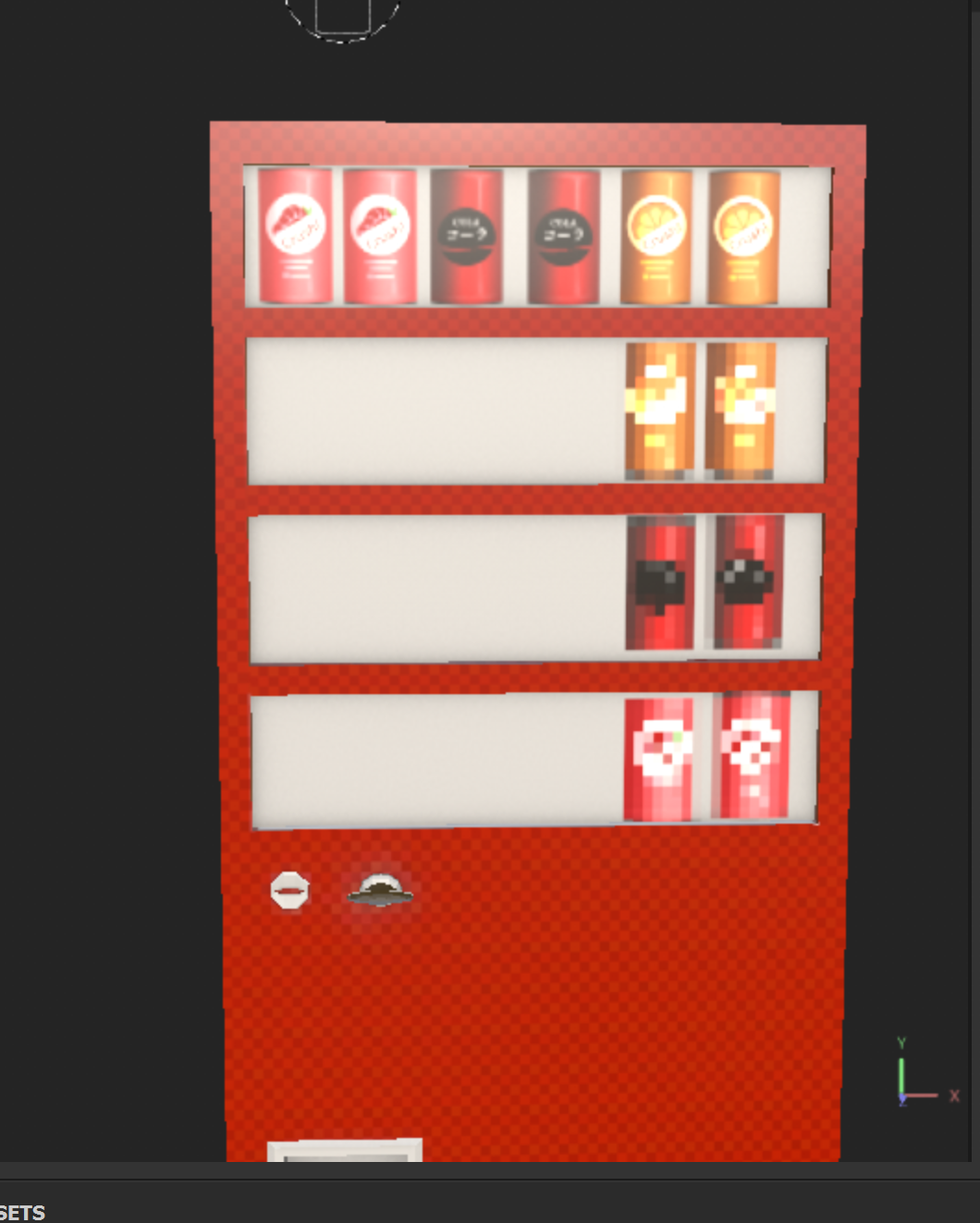
Playing around with some of the newspaper designs was good too, and they translated really well into Substance Painter!

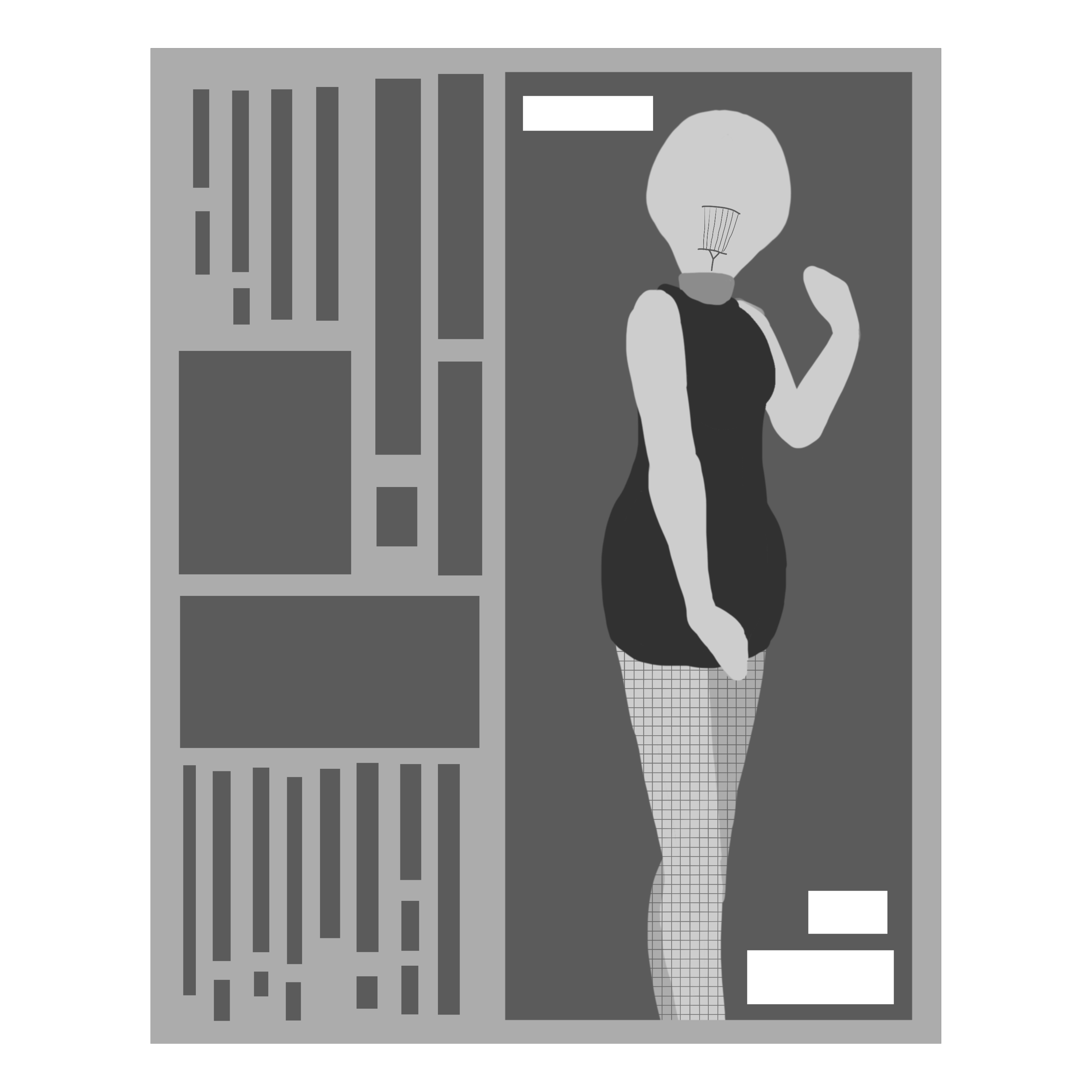
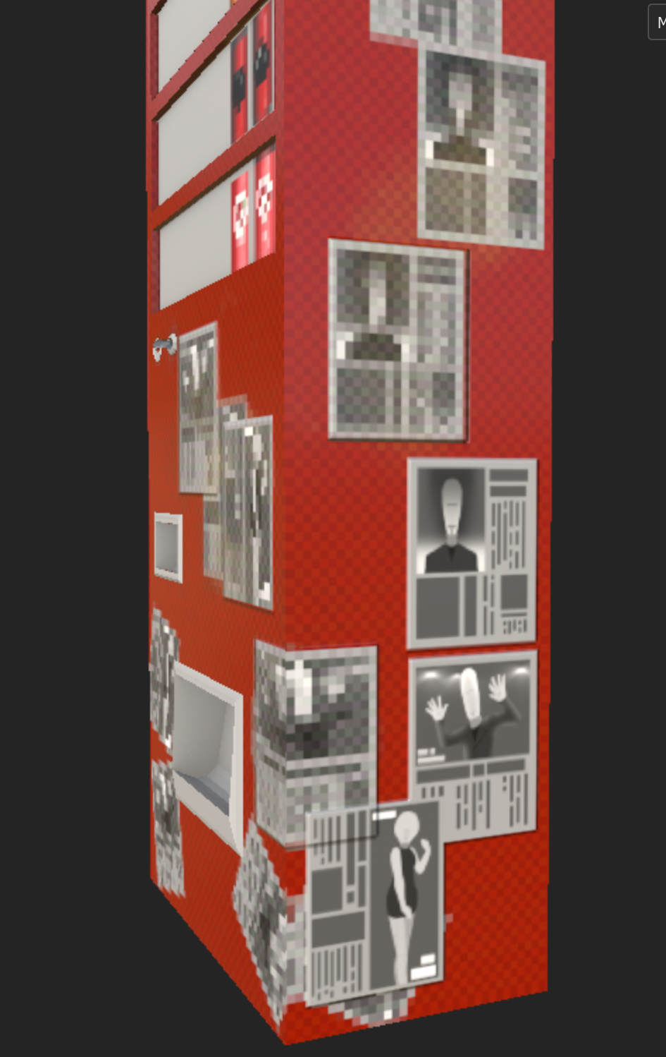
Even though the newspaper pages get pixelated, you can still recognise some of the images and make things out, which really sells the look in my opinion!
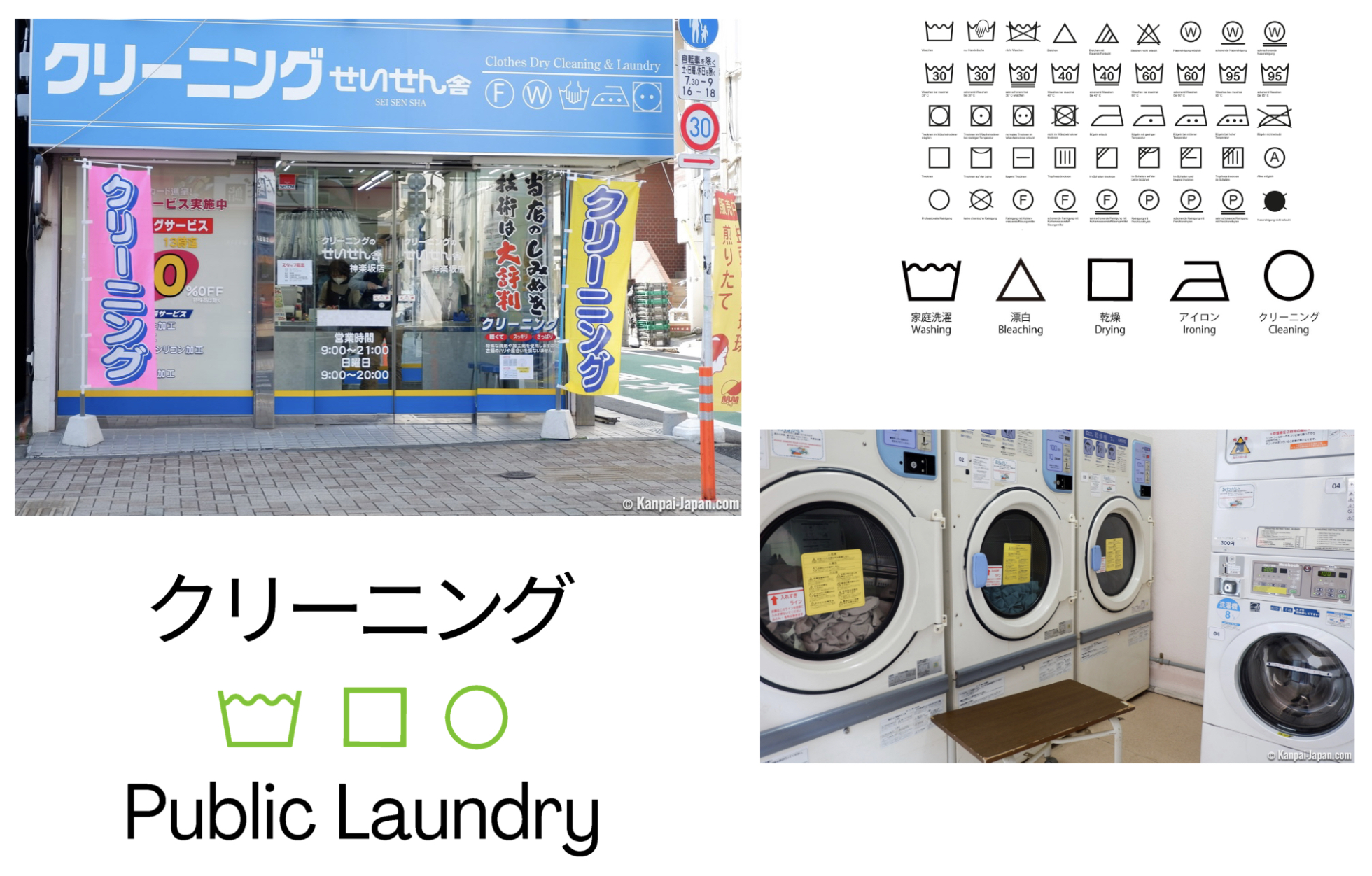
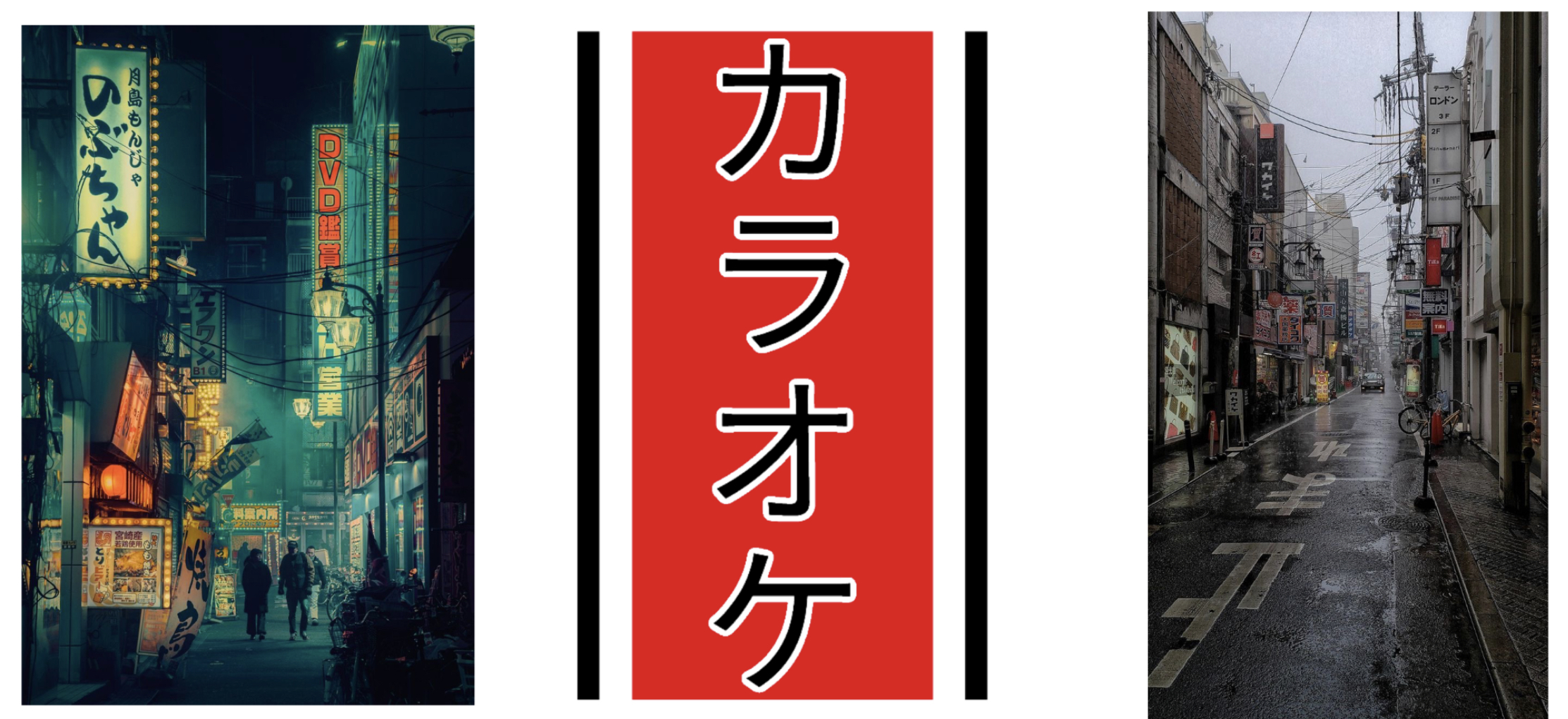
I was also very careful in my design choices for signs and made a lot of reference to current and old signage in Japan. Karaoke bars and general street signage on the sides of buildings is very bright and has high contrast, so the Karaoke bar sign I made a stamp for features just the name karaoke against a red background. The Laundry sign was also surprisingly difficult to design, but once I saw the style of signage at public laundries I knew we could have a simpler design. It also means it will translate well into Substance Painter once we pixelate the textures, and the icons should still be noticeable and definitely sell the atmosphere of 1980s, cluttered, street-style Japan.” - Tahlia (2D artist)
These are only some of the designs of the stamps we have for the game textures as well! We have about 8 options for food packaging that we haven’t shown you yet, for example, so keep an eye on future updates and our social media to see more progress shots!
Visceral Carnage
| Status | In development |
| Author | Battle Damage Studio |
| Genre | Action, Shooter |
| Tags | 3D, Arcade, First-Person, Low-poly, Short, Singleplayer, Unreal Engine, Virtual Reality (VR) |
More posts
- Post Mortem - Perth Games Festival (PGF)Nov 27, 2022
- Final StepsNov 11, 2022
- Leading To The End!Nov 01, 2022
- Art DevelopmentOct 30, 2022
- Let’s Talk MerchOct 22, 2022
- Level TwoOct 17, 2022
- Character DesignOct 14, 2022
- Texturing StylesOct 08, 2022
- Playtesting Level OneSep 20, 2022
Leave a comment
Log in with itch.io to leave a comment.