Map Modelling
While we’ve been busy with smaller designs like our props, but we’ve kept pretty quiet on the map and level design. Our team is very small, so we have always aimed for a couple of game levels even though only one seemed to suit our scope best.
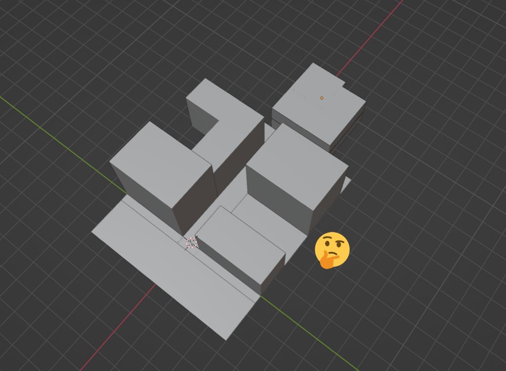
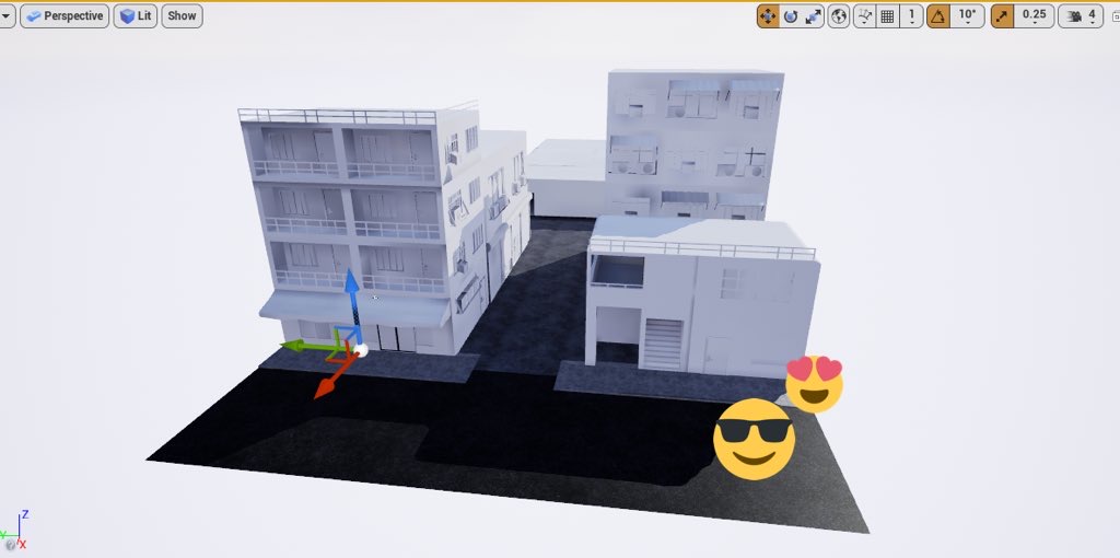
Here are some before and after shots of the first map - who would’ve thought just a few simple blocks could become multiple several buildings! 

“I experimented with some buildings with having interiors, but ultimately cut them and made the basic level layout with no interiors in mind besides the main building. The scale was important when considering using VR, as the buildings were meant to tower above the player and really be as immersive possible, and still promote a gloomy atmosphere with the looming walls.”
Another thing to consider is how interactivity is so essential, because the core of the game is that "everything" is a weapon. It’s one thing to put a player in a room, but to have them feel truly engaged is our goal. Props and the environment are key, since it’s definitely not just a random arena that we put players into. This main level was inspired by 80's style Hong King and Japan, and we pushed the shop-side and alleyway aesthetics to surround the players and really enforce our cluttered and pressurised environment.” - Deklan (Tech Lead & 3D Modeller)
We’ll be showcasing more of our upcoming designs and future level plans, so keep an eye out for the next Dev Blog!
Visceral Carnage
| Status | In development |
| Author | Battle Damage Studio |
| Genre | Action, Shooter |
| Tags | 3D, Arcade, First-Person, Low-poly, Short, Singleplayer, Unreal Engine, Virtual Reality (VR) |
More posts
- Post Mortem - Perth Games Festival (PGF)Nov 27, 2022
- Final StepsNov 11, 2022
- Leading To The End!Nov 01, 2022
- Art DevelopmentOct 30, 2022
- Let’s Talk MerchOct 22, 2022
- Level TwoOct 17, 2022
- Character DesignOct 14, 2022
- Texturing StylesOct 08, 2022
- Texturing Plan - StampsSep 28, 2022
- Playtesting Level OneSep 20, 2022
Leave a comment
Log in with itch.io to leave a comment.